About a week ago, Google decided it was time for a face-lift and redesigned their logo. This change not only occurred on their website, but also on their mobile app as well. Being the lover of Google that I am, I was pretty excited about the change; I love it when companies I love try something new. But this new logo change has me, as well as others, scratching my head. After about a week of it being released, I just don't know how I feel about it yet. Part of me loves it, part of me hates it and I haven't picked a side yet. First of all, let's take a look at a timeline of Google's logo:
http://logo-timeline.wikia.com/wiki/Google
http://logo-timeline.wikia.com/wiki/Google
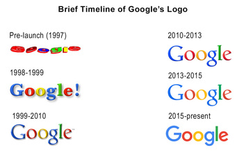
While one may not think of Google going through some major changes as far as image goes, they have actually improved quite a bit since their pre-launch days in 1997. That logo looks like something a first grader would make in Word Art in Microsoft Office. So let's just be thankful the new logo doesn't look like that!
Now, a lot of journalists are going to try to tell you why you should love/hate this logo, but I'm not a journalist so hopefully you guys will make your own judgements about this issue. But Sarah Larson at The New Yorker, explains the uproar over this change very well. In her article, she states that it isn't the logo itself that rubs people the wrong way; it's the way the logo makes us feel. While Google does have good reasoning behind the logo change (mainly because of mobile devices), Larson's comments on the company's image hits the nail right on the head.
So what's my stance on the new logo? All in all, I think I like it. It will take some getting used to (especially when using the mobile app), but I think it's a step in the right direction for Google.
What do you guys think of Google's new logo?
Thanks to logo-timeline.wikia.com/wiki/Google for the Google logo pictures!
0 Comments


 RSS Feed
